When Does a Website Need a Redesign? 8 Objective Signs, Not Just Boredom
Feel like your website needs a refresh but are not sure? Eight objective signs that separate a real need from simply being bored of it.
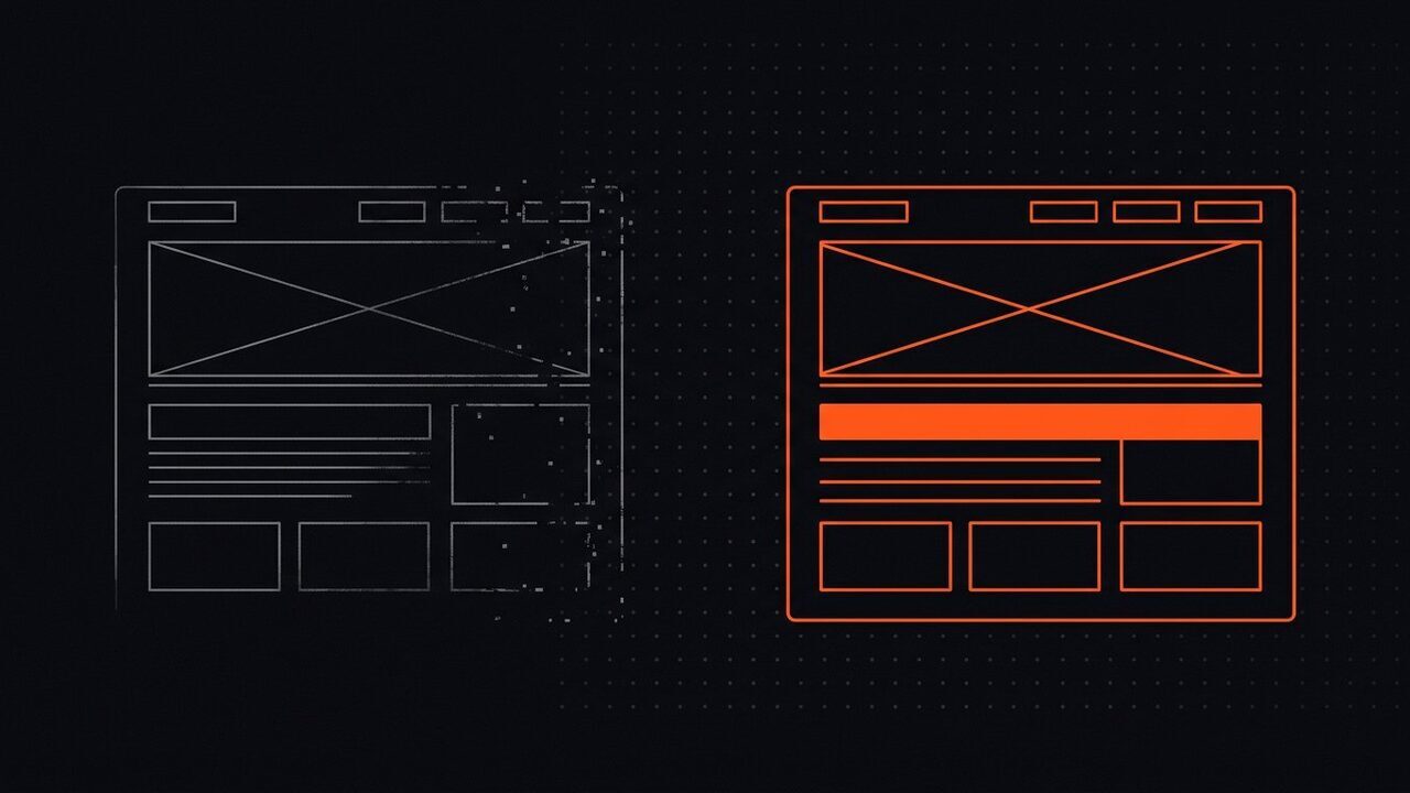
“Our website looks dated, it probably needs rebuilding.” This sentence often appears after a business owner sees a competitor’s website looking fresher, or after seeing designs on social media. The desire is understandable, but a redesign is major work, can cost as much as building a new website, and done at the wrong time can damage search positions built over years.
A more useful question is not “does my design still look good?” but “is my website still doing its job well?” The two questions are often treated as the same, though the answers often differ.
This article covers the objective signs that a redesign is genuinely needed, and the signs that can actually be solved with small fixes. If the problem is more general than appearance, the checklist is in the article on signs your website needs care.
Sign 1: Visitors leave before reading anything
A slow page-load time is both a design and a technical problem, and its impact is the easiest to see. The effect of speed on sales figures is covered specifically in a slow website and its impact on sales. If the bounce rate is high while the content is relevant, the cause is usually the first page being too heavy: large uncompressed images, a layout shifting as it opens, or a page waiting for too many files before showing anything.
Importantly: this problem can sometimes be fixed without a full redesign. Compressing images, fixing the load order, and removing unnecessary files often cuts load time in half without touching the layout.
Sign 2: More than half your visitors use phones, but the design was made for wide screens
Open the analytics report and look at the device mix. For most service and retail businesses, more than 60 percent of visits come from phones. Now open your website on a phone and answer simple questions: how many times do you have to pinch the screen to read text? How many times do you press the wrong button?
If the phone experience feels like a smaller version of the desktop view — tiny text, buttons close together, long forms — that is a sign the design structure needs reorganising, not just recolouring.
Sign 3: The path to action is convoluted
Try to do the thing you most want visitors to do: send an enquiry, order a product, or call. Count every step required.
If it takes more than three clicks from the homepage to the main action, or the important button is several screens down, the cause is structure. This is the one problem that nearly always requires reworking the layout rather than a small fix.
Sign 4: The content no longer fits
Websites grow. Products increase, services branch out, articles pile up. A design made three years ago often has no place for the kind of content you produce now, so new pages are forced into old patterns and the result feels awkward.
If every new piece of content needs special technical skill just to display correctly, that is a sign the design framework no longer fits. And if the issue is not the design framework but that nobody manages the content at all, that is a different problem covered in the article on website management services.
Sign 5: Forms and transactions fail to work
This is the most urgent sign and the most often ignored, because website owners rarely try sending a message to themselves. Test now: send one message through the contact form, and check whether it reaches your inbox. Try one order process to completion, and check whether the confirmation genuinely sends.
If an important part fails, that is not a redesign consideration — it is an emergency to be handled today.
Sign 6: Speed and security are hard to fix from inside
There is a point where an old structure has piled up so much extra code that every small fix creates a new problem. If every update produces an error, and every attempt to speed up the website causes side effects on other pages, rebuilding on a clean foundation is usually more time-efficient than continuing to patch.
This is a technical decision, and it should be based on an inspection result, not a feeling.
Sign 7: The website no longer reflects the scale of the business
This is about trust. If a corporate potential client opens your website and sees a design from five years ago, a question arises in their mind without being spoken: if their website is like this, what about the rest of their work?
This sign is the hardest to measure, but its effect is real in businesses that sell trust.
Sign 8: You no longer believe in the website
This sounds subjective, but it has practical meaning. If you are reluctant to share the website link with potential clients, or always add the explanation “the website just has not been updated”, that is a sign you yourself no longer treat the website as an asset.
This sign is important to acknowledge, but it should be the basis for checking the earlier signs, not the only basis for deciding.
Signs that do not actually need a redesign
Many redesign urges come from things that can be solved far more cheaply.
- Colours and typography feel boring. Updating the colour palette, typeface, and spacing can transform the impression at a fraction of the cost.
- Service pages feel unconvincing. Often what is missing is not the design but the content: explanations that are too generic and have no evidence.
- Competitors look more modern. Visual change online is constant. If you chase every trend, you will redesign every year with no proportionate benefit.
- One page has a problem. A specific page can be fixed on its own without touching the whole website.
Testing these first is the most economical way to get the improvement you want.
If a redesign is genuinely needed: a safe order
A smooth redesign follows the same pattern: a disciplined order of work.
- Measure the starting condition. Record speed, search rankings for a few important keywords, and the number of leads coming from the website per month. Without baseline data, you will never know whether the redesign worked.
- Set measurable goals. For example “load time under 2.5 seconds on mobile” and “contact form submitted at least 10 times a month”.
- Make a full copy of the old website. Not only for safety, but as a comparison and a content source.
- Design with real content. Designing with placeholder text produces a design that looks good in a mockup but breaks when filled with the real thing.
- Work in a separate environment. The old website keeps running while the new one is prepared.
- Prepare URL redirects. Every old page must point to its equivalent new page. Skipping this step is the fastest way to lose search rankings.
- Test before and after launch. Test forms, transactions, phone display, and speed — before traffic is switched over.
- Monitor for two to four weeks after launch. Check errors, missing pages, and search position changes. Quick fixes after launch are far cheaper than fixing a problem that has run for months.
What a redesign costs and what inflates it
A full redesign for a business website generally falls in the range of Rp8m to Rp40m, depending on the number of pages, features, and level of design customisation. An online store with hundreds of products and several transaction types can be higher.
What raises the cost is usually not the design, but the things around it:
- Manual content migration. Moving hundreds of articles or products one by one takes considerable time.
- Re-integrating. Payments, shipping, tracking, and other systems need reinstalling and re-testing.
- Page URL adjustments. If the URL structure changes, redirects must be prepared and tested one by one.
- Cross-device testing. The more device types and browsers supported, the longer the testing.
- Speed fixes after launch. A new design usually brings new files, and those need optimising again.
How to control the cost: lock the scope from the start, separate the work that can be postponed, and set clear completion criteria. A redesign without a written scope almost always expands.
If the budget is limited: a phased redesign
You do not have to wait for tens of millions to make the website feel better. A phased approach often gives results nearly comparable at a far smaller cost.
- Fix the biggest blockers first. Usually this is page speed and the path to action.
- Refresh the visual identity in the most-viewed parts. The top of the page, the buttons, and the typography give the biggest impression per rupiah spent.
- Overhaul one type of page. The service page, for example, because that is where buying decisions form.
- Add the content that is currently missing. Often what makes a website feel dated is not the design but content that was never updated.
- Schedule a full redesign only if the framework is genuinely inadequate.
With this order, each stage produces an improvement you can see and measure, without waiting for a big project to finish.
A redesign is not the finish line
The mistake most often made after a redesign is thinking the work is done. In fact the new website will age at the same speed as the old one. Within two years, its components need updating, images slowly get heavy, and content starts to go stale.
So a redesign should be scheduled together with care, not as a replacement for it. After the new website launches, continue with monthly care and consistent content additions. Otherwise, three years from now you will start the same conversation again, at greater cost.
The one thing most often forgotten
A redesign is often planned as a big project with a big budget, when what actually keeps visitors is simple: pages that open fast, text that is easy to read on a phone, action buttons that are clearly visible, and important information where it is expected. If those four things are in place, your website is usually working better than many competitors with newer looks.
So before approving a redesign budget, make sure you have checked those four things. If not, they can be fixed first at a far smaller cost, and your redesign decision will be much better directed.
A practical step for you
If you feel the website needs updating but are not sure how big the job is, start with an inspection. We check speed, technical condition, SEO structure, and the path to action through the free website health audit. The result is a set of recommendations split between small fixes and work that genuinely needs reworking.
If small fixes are enough, we will say so. Selling an unnecessary redesign is not how we work, and clients who feel honestly served come back.
Does any of this look like your website?
Tell us on WhatsApp. We look first, explain what needs fixing, then you decide. For a fuller picture, request the free audit.
Related articles.
Website Care Services: How They Differ from One-Off Repairs
Scheduled care or call a technician when it breaks? A comparison of cost, risk, and results between the two ways of maintaining a website, with numbers.
Website Management Services: When Your Business Needs a Team, Not Just a Technician
How website management differs from technical maintenance, what work it covers, and the signs your business needs a management team, not just a repair.
Build vs Maintain a Website: Why the Upfront Price Is Not the Real Cost
The price of building a website is only the entry cost. Here are the other costs that often go uncounted, plus a three-year comparison that makes it clear.